Why Negative Space Gives a Picture Room to Breathe
Negative space in a picture can clarify a focal point, balance crowded forms, or create tension; learn what to notice and which compositional choice fits.
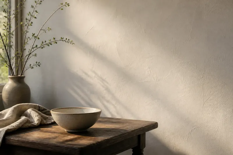
A pale gap between a figure’s hand and a cup can make that small gesture easier to read than either object alone. Negative space in a picture is the area around and between its forms, and it can direct attention, set a mood, or bind separate shapes into a single composition. What it does depends on the image and on how the viewer’s eye moves through it.
The term does not mean that the area is literally blank. A wall may have a wash of color, paper may show its grain, and a patch of sky may carry a faint cloud. These areas count as negative space when they function in relation to the more prominent forms. The useful question is not simply “What is empty?” but “What does this area make the other forms do?”
What should you notice first in negative space?
Begin with the edges where a subject meets its surroundings. The contour of a shoulder, vase, branch, or roofline also shapes the area beside it. Follow that surrounding shape as if it were an object in its own right. Does it widen, narrow, turn, or press against the edge of the picture? Those changes can lead the eye as strongly as the depicted subject.
Then notice the spaces enclosed by forms. The opening inside a handle, the wedge between two leaves, or the small triangle beneath a bent arm can become a distinct shape. If that shape is clear, the objects around it often feel more deliberate. If it is pinched or ambiguous, the objects may appear to merge.
Finally, compare the visual weight of the open areas. A large quiet patch can balance a dark cluster without matching it in size, because color, contrast, and edge complexity also affect how strongly a region attracts attention. Negative space is not a formula for equal halves. It is a relationship among shapes, marks, and the viewer’s attention.
Which composition fits the situation?
A decision guide is useful because the same open area can help one image and weaken another. Start with the effect you want the composition to have, then ask whether the surrounding space supports it.
- If the subject is hard to identify, give its outline more separation. A narrow gap can disappear when it meets a nearby shape of similar tone. Increase the visible separation, simplify the nearby edge, or adjust the contrast so the subject reads clearly. This choice fits a portrait, still life, or illustration where a particular gesture or object needs to register quickly.
- If the image feels crowded, remove competition rather than merely enlarging everything. Look for small forms, dark marks, or busy contours that interrupt the open areas. Reducing detail in one region can restore a calm patch and make the remaining forms feel more connected. This suits a composition in which several elements matter but none should dominate by accident.
- If you want tension, let a form approach an edge or another form. A close gap can feel compressed, especially when it narrows toward a point. Keep enough space for the intended shape to remain legible; otherwise, tension becomes a reading problem. This choice works when the subject should feel constrained, alert, or slightly unsettled.
- If the image feels lopsided, compare visual weight before moving the main subject. A broad, low-contrast area may counter a smaller but darker or more detailed cluster. Try changing the size, tone, or texture of the open region first. This is useful when the subject itself is well placed but the composition still pulls too strongly to one side.
- If the work needs a quieter mood, simplify the spaces around its focal point. Fewer competing edges and more continuous areas can slow the eye. This does not require making the whole image pale or sparse: a composed field near the focal point may be enough to create contrast with a lively, detailed region.
Say you are arranging a painted bowl beside a folded cloth, and the gap between them has collapsed into a thin, uneven sliver. If the aim is to make the bowl feel stable and easy to inspect, shift the cloth slightly outward and redraw the intervening shape as a clear wedge. The expected visible result is a more distinct bowl contour and a gap that reads as intentional. If the aim is unease, keeping the sliver may fit better, provided the viewer can still tell where each form ends.
How can open space direct the eye?
Attention often follows changes in contour and contrast. A long, tapering area can point toward a focal object; a curved gap can echo a figure’s movement; repeated openings can lead the eye across a row of forms. An open region may also slow the gaze by offering fewer sharp edges to follow. This is why space is not just a pause between important things. Its shape and placement influence the route through the picture.
Direction can come from several areas working together. In a drawing of a person looking toward one side, the open area in front of the gaze may feel expansive, while a tight margin behind the head can make the figure seem to face into the picture. Reverse those proportions and the same pose may feel pressed toward the frame. The subject has not changed, but the space alters how its direction is perceived.
Negative space can also connect separated elements. If the gaps around a pair of objects share a similar curve or width, the eye may group them even when they do not touch. Conversely, a sharp change in the gaps can distinguish objects that sit close together. Look for this effect in posters, photographs, prints, and paintings: the surrounding shapes can organize a scene before the viewer has examined its details.
What changes when the space is active?
Artists sometimes make an open area carry as much visual interest as the main subject. Its boundary may form a recognizable silhouette, its color may hold a strong contrast, or its shape may repeat elsewhere. In such a composition, “positive” and “negative” are useful descriptions, not fixed rankings. The viewer may shift attention between a vase and the shape between its stems, or between a figure and the light field that surrounds it.
This balance is especially noticeable in cut-paper compositions, stencil designs, and ink drawings. A cutout makes the relationship literal: removing a piece creates a contour that belongs to both the remaining paper and the opening. In a brush drawing, by contrast, the paper may stay untouched, but its shape can still act as a deliberate part of the design. The medium changes how the area is made, not whether it can matter.
Active space need not be complex. A plain field can become striking when a single contour divides it into an unexpected shape. The area may appear to press inward, flare outward, or form a second image that competes with the first. When that happens, the composition invites a viewer to switch between figure and ground rather than settle on one reading.
What questions help you judge a picture’s spacing?
How do I tell whether a gap is intentional?
Look for a relationship between the gap and the forms around it: a repeated angle, a purposeful taper, or a clear contrast can make it seem composed. If it changes shape without helping separation, rhythm, or mood, it may be an incidental opening.
Does negative space have to be white?
No. It can be any color, tone, texture, or depicted environment that functions as the area around or between the main forms. A dark background can be negative space, while a bright object can remain the focal form.
Can a crowded picture still use negative space well?
Yes. The open areas may be small, but their contours can separate figures, establish rhythm, or make a busy arrangement readable. The question is whether those gaps have useful shapes, not whether the composition contains a large empty field.
Should I judge the spaces before or after the objects?
Try both views. First read the depicted objects, then look at the gaps as if they were solid shapes; switching between these approaches reveals whether the composition depends on clear separation, active tension, or a deliberate ambiguity.
What is not worth adjusting?
Do not try to make every gap evenly sized or every side of a subject equally open. Regular spacing can be useful in a repeated pattern, but it can also flatten a picture whose forms need different degrees of closeness. Nor does adding more empty area automatically create calm: a broad gap in the wrong place can separate elements that should feel connected.
When drawing or composing, squinting can soften detail and make large areas of light and dark easier to compare. A simple thumbnail or a small paper cutout can also reveal whether a gap is legible before you refine surface marks. These are quick ways to inspect relationships, not rules that every image must obey.
Negative space in a picture is most useful when it answers a specific compositional need: make a contour clearer, connect forms, redirect the gaze, or create pressure. If an open area already supports the intended reading, leave it alone. The decision is not to fill or empty a picture, but to recognize which relationships its spaces are already making visible.